

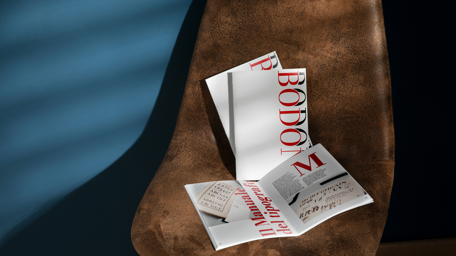
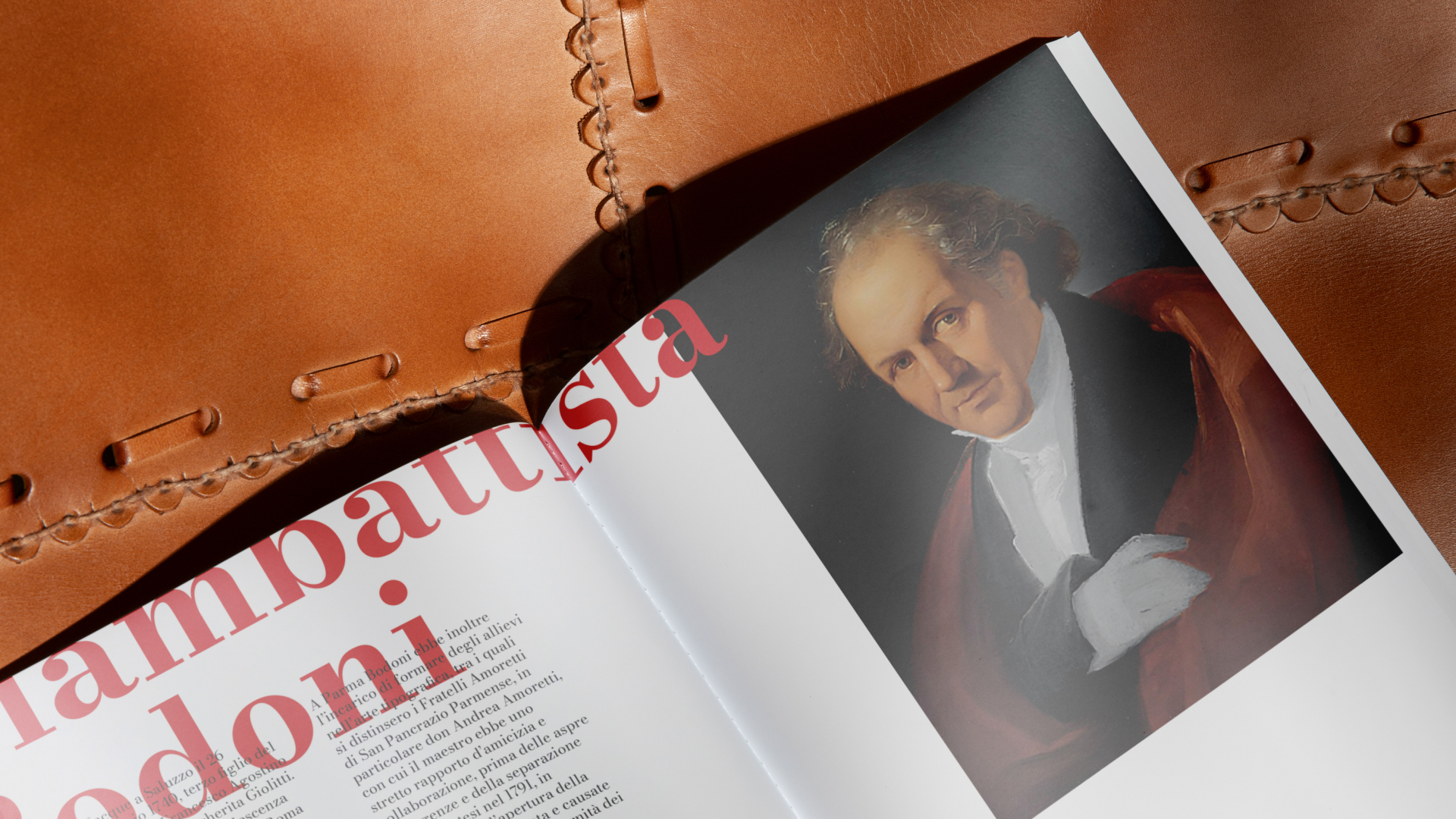
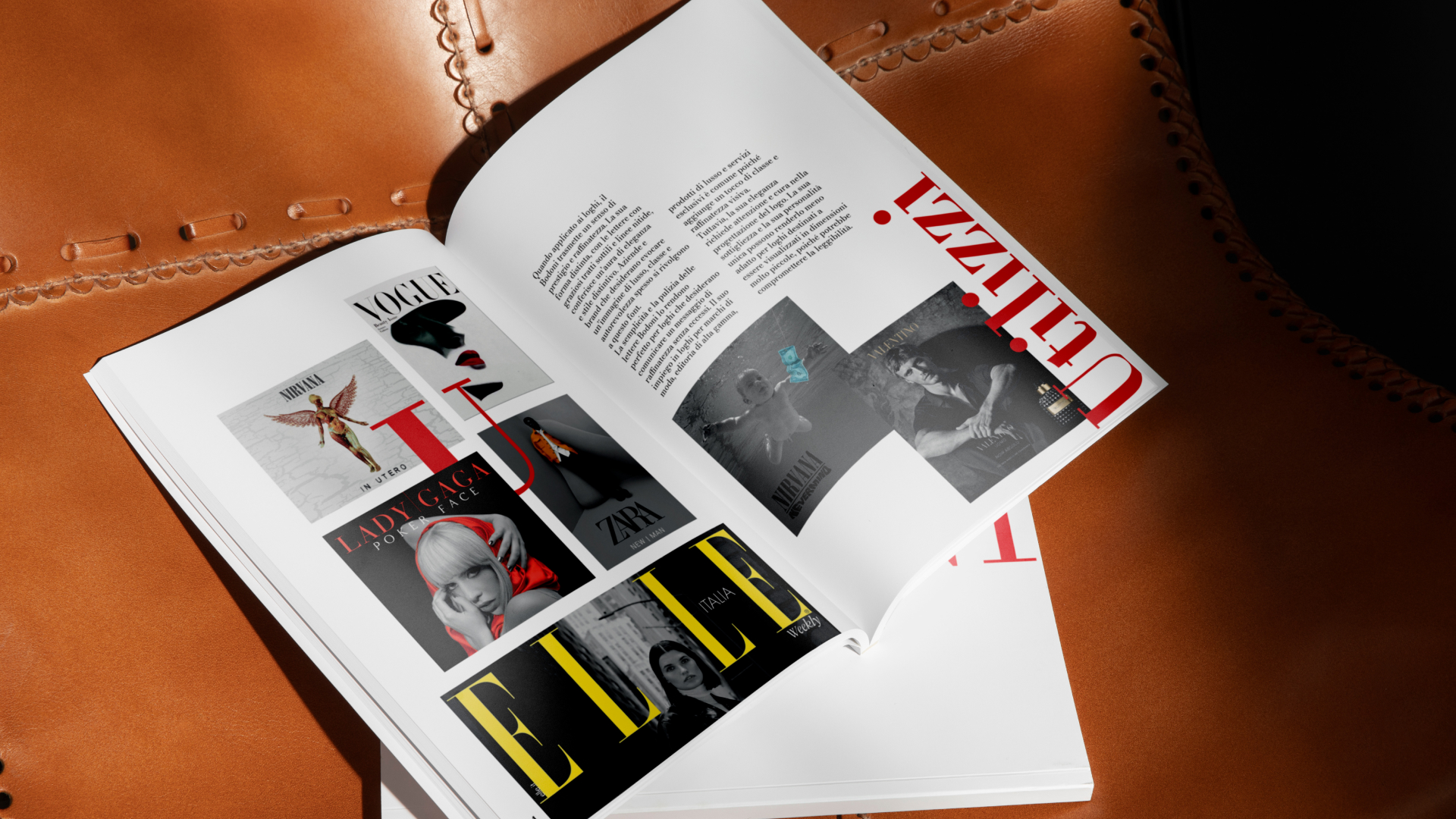
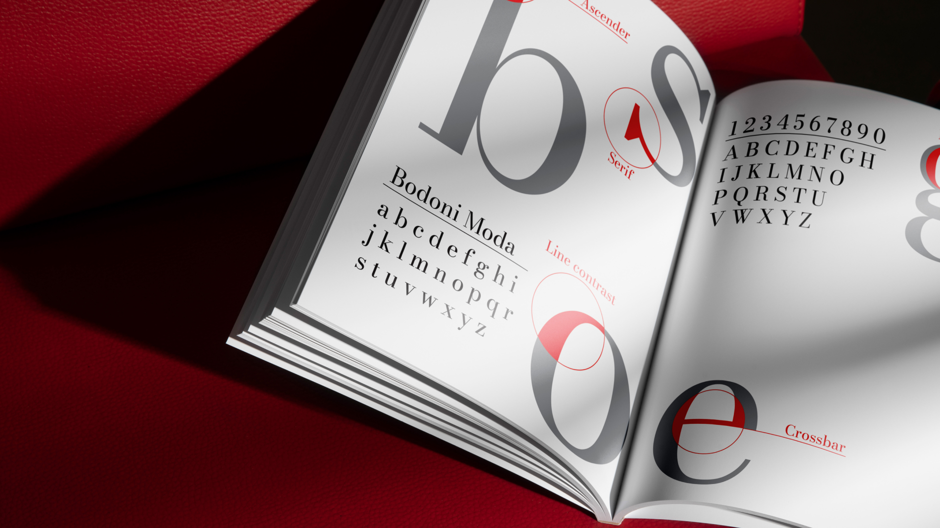
This editorial project is dedicated to one of the most influential typefaces in typographic history: Bodoni. The magazine explores its origins, design methodology, and practical applications, tracing its evolution from its 18th-century creation to modern-day graphic design.
As a quintessential example of Neoclassical typography, Bodoni is celebrated for its dramatic stroke contrast, clean lines, and elegant, flat serifs. Its precise, geometric structure imparts a refined and formal tone to any composition. These defining characteristics were directly integrated into the editorial layout, allowing the typeface itself to become the central design hero and primary visual element.
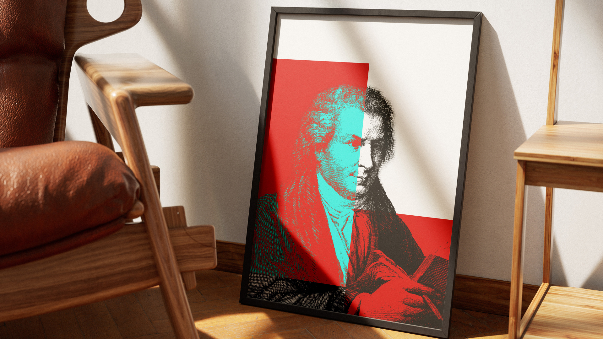
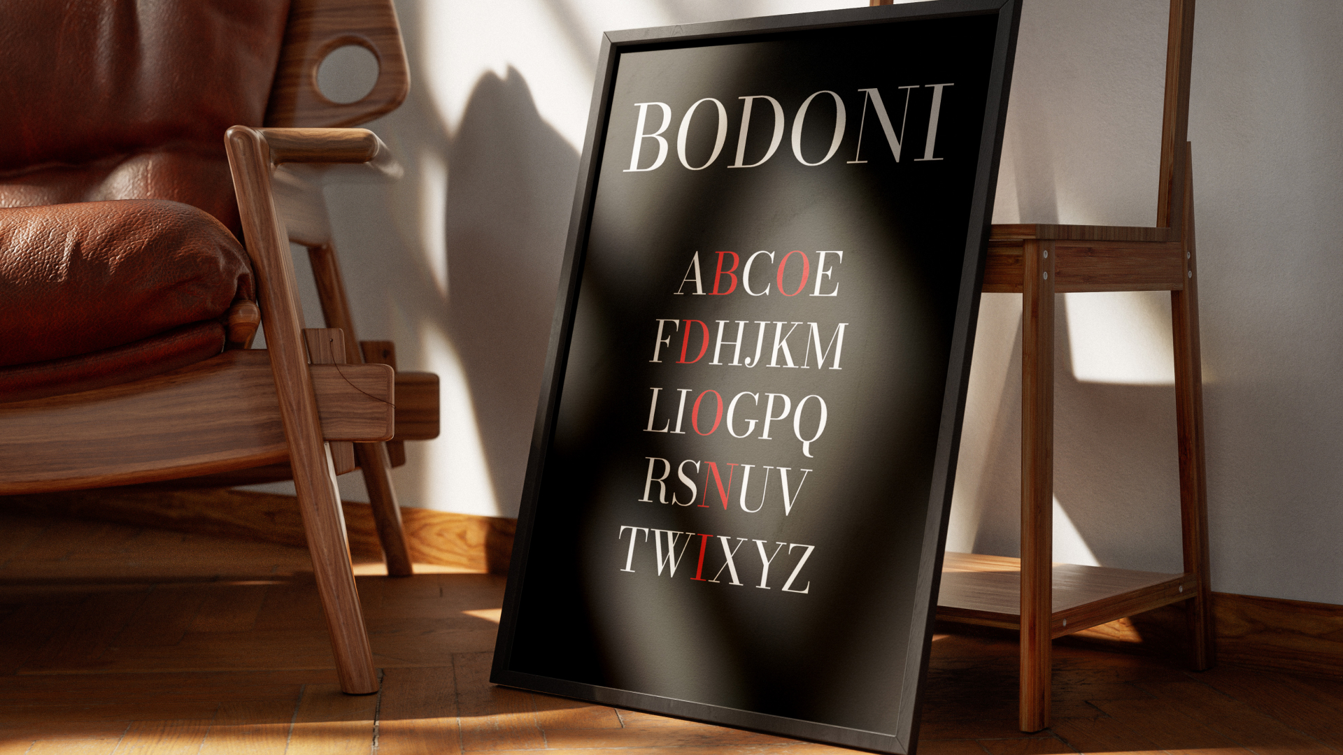
Additionally, the magazine features a series of pull-out A3 posters inspired by the font's distinct geometry and paying homage to its creator, Giambattista Bodoni.