

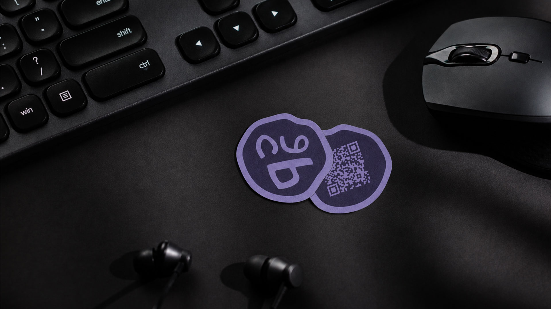
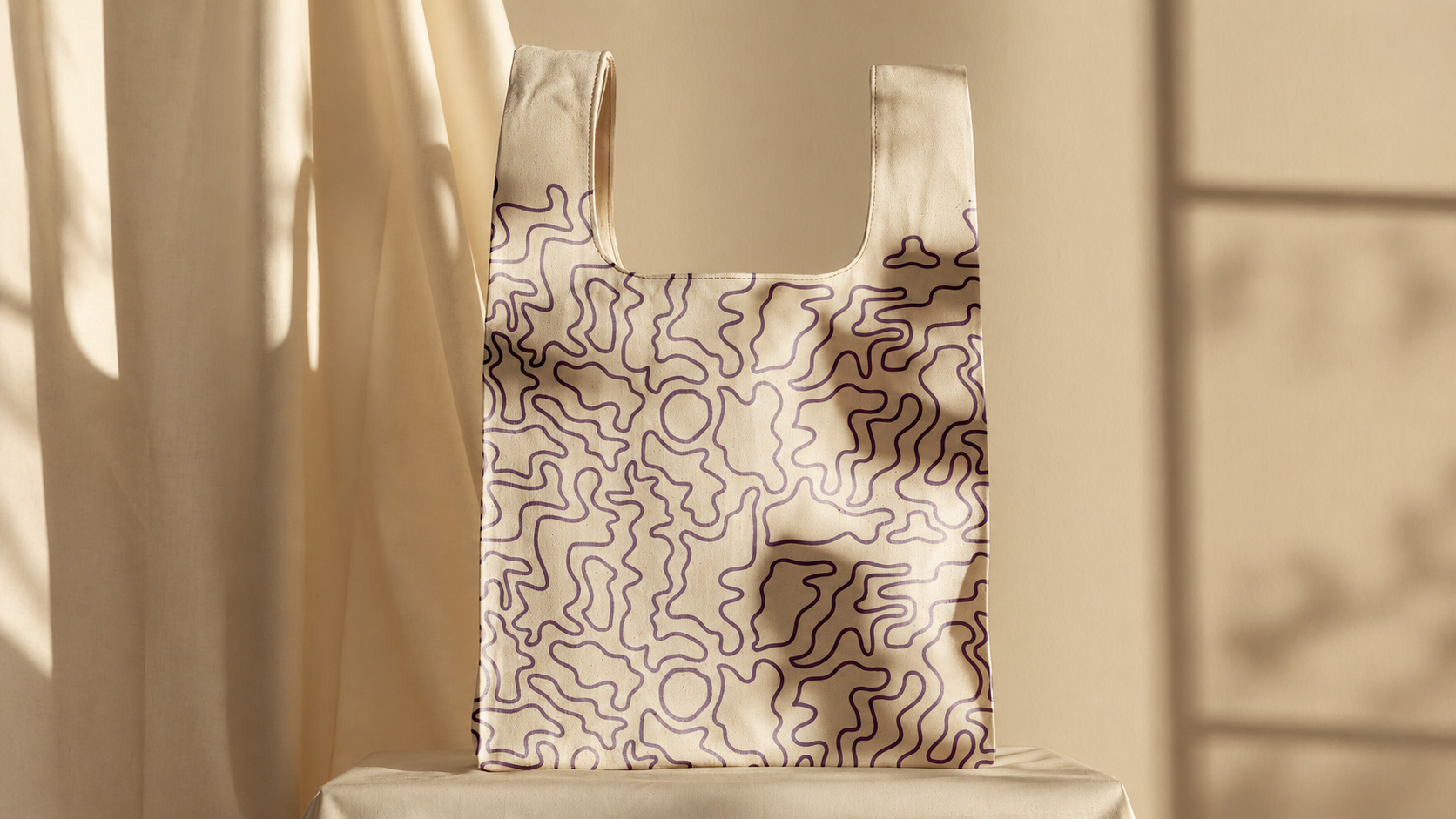
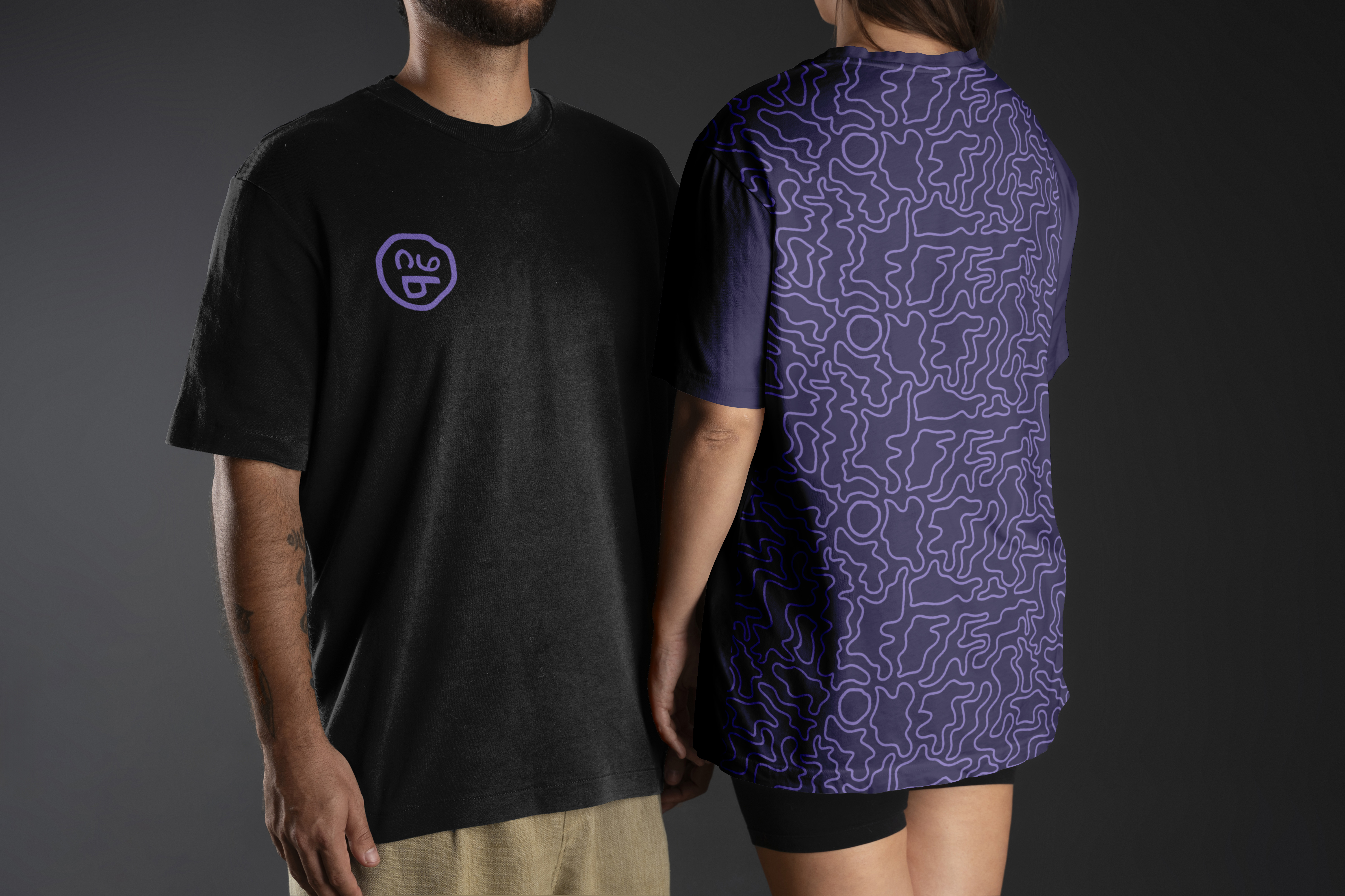
This personal brand rejects classic refinement in favor of bold visual impact, embracing an unconventional, slightly strange first impression that leaves a lasting memory. The identity was not born from a calculated strategy, but from pure serendipity: the nickname Ube emerged naturally before discovering its connection to Dioscorea alata—the vibrant purple yam native to tropical Asia also known as ube.
Drawing directly from its namesake, the brand palette reflects the rich, raw hues of the root, balancing deep indigo tones and rich purples. The visual identity translates this organic origin into an eccentric, friendly emblem: an irregular badge where the letters U, B, and E are cleverly arranged to form a playful smile.
To complement the mark, the typography utilizes Truculenta, an expressive typeface whose irregular, dynamic letterforms perfectly mirror the organic language and quirky, memorable spirit of the brand.